Friday, May 13, 2011

Japan: The Land of The Setting Sun

*** PRESENTATION UPDATE: June 2011 ***

Find below a presentation I put together in January/February about Japan.

After reading a lot about the subject from people like Kyle Bass, Hugh Hendry, John Mauldin, David Einhorn and others, I decided to study it too. I like these guys because they demonstrate they have sound investment processes and play their ideas through ways that give them a big upper hand in case they're right x what they would lose if wrong. A lot of money managers do the opposite. They gain small for a long time until they don't. And they're gone.

The data presented was sourced from a variety of entities and might not be 100% accurate/on the spot, but it sure gives you a very good idea about where Japan now stands in terms of growth potential, debt sustainability and risk-reward. It hasn't been updated to include after-earthquake/tsunami economic data and governtment/central bank response, however these tragic facts only make the case even more interesting. In my opinion they only increased the probability of my desired outcomes.

At the end I presented trade ideas that, together, from what I call the pillars for the bet against Japan.
Pricing has, of course, changed since then, but not a lot. As others have mentioned, the asymmetry is huge.

The final word on this trade is simple: confidence. If the music stops for JGBs, Japan could be gone quickly.

And if the trade proves to be correct the owner of the bets must therefore be worried about who the counterparties are. Because OTC dealers could be wiped out.


The Tail Chaser - The Land of the Setting Sun


*Disclaimer: charts and data are presented as I receive/see them. Sources are usually not checked for validation and my own calculations are of 'back of the envelope'-type. I am aware that some math that I do myself might be wrong and/or misleading to some extent. In financial markets the rate of change of economic data is often more important than the actual level and the perception of 'what is priced in' is more important than 'what is actually going to happen'. This is actually the way people pick entry and exit points. So... yes, sometimes you might say 'This guy is an idiot, this is way wrong!' with a high conviction, being right. Not to worry. Markets are made of expectations and the clash of conviction between its participants. Portfolio managers know that being an idiot is sometimes profitable and being smart is often a bad choice. It is all reality, sometimes good, sometimes bad. By the way: corrections to my analysis and intelligent debate is welcome. theintriguedtrader AT gmail do com

The Sceptical Strategists - Correlation Collision Part 2

Ladies,

Below a good piece from Kevin Gaynor, one of Nomura's Sceptical Strategists.

I had the pleasure to meet him and Bob Janjuah a few months ago and recently exchanged a few e-mails with Bob.

I guess their predictions have been on track with what we've talked about earlier this year. Therefore, one more reason to analyze their views, findings, etc.

These are experienced 'realists' who, despite defending that we're suffering from serious structural economic problems in Developed Economies, still point to bullish views in certain asset classes. Eearlier this year it was risk-markets. This time USD and Bonds on the back of ending monetary stimulus in the US that should reduce the amount of USD available (liquidity), therefore impacting economic growth and risk-markets.

Weekend reading, for when the kids are running around the house like maniacs and your husband is watching some soccer match.


2011 05 13 - The Sceptical Strategist - Kevin Gaynor - The Correlation Collision Part 2

*Disclaimer: charts and data are presented as I receive/see them. Sources are usually not checked for validation and my own calculations are of 'back of the envelope'-type. I am aware that some math that I do myself might be wrong and/or misleading to some extent. In financial markets the rate of change of economic data is often more important than the actual level and the perception of 'what is priced in' is more important than 'what is actually going to happen'. This is actually the way people pick entry and exit points. So... yes, sometimes you might say 'This guy is an idiot, this is way wrong!' with a high conviction, being right. Not to worry. Markets are made of expectations and the clash of conviction between its participants. Portfolio managers know that being an idiot is sometimes profitable and being smart is often a bad choice. It is all reality, sometimes good, sometimes bad. By the way: corrections to my analysis and intelligent debate is welcome. theintriguedtrader AT gmail do com

Some low-profile U.S. weekly data

There's some data that I would consider useful in gauging the pace of the US growth story and I think no one can deny this. Just look at late 2008's path compared to normal trends or 2007's curve.

Those are, already presented here, Edison US Electricity Output usage and American Association of Railroads Freight Carloads.

Shown below in 4-week moving averages:


For the Railroad thingie... considering the last data point vs 2010's 7-May data (52week change)... it is the worst YoY net-change since Jul2010. Too early to say whatever. But, you know. It's here.

For Electricity Output the data is the worst YoY since February, easily spotted on the chart too. So here, nothing standing out.


*Disclaimer: charts and data are presented as I receive/see them. Sources are usually not checked for validation and my own calculations are of 'back of the envelope'-type. I am aware that some math that I do myself might be wrong and/or misleading to some extent. In financial markets the rate of change of economic data is often more important than the actual level and the perception of 'what is priced in' is more important than 'what is actually going to happen'. This is actually the way people pick entry and exit points. So... yes, sometimes you might say 'This guy is an idiot, this is way wrong!' with a high conviction, being right. Not to worry. Markets are made of expectations and the clash of conviction between its participants. Portfolio managers know that being an idiot is sometimes profitable and being smart is often a bad choice. It is all reality, sometimes good, sometimes bad. By the way: corrections to my analysis and intelligent debate is welcome. theintriguedtrader AT gmail do com

GS - A Cleaner -and lower- Read on Jobless Claims

Interesting reading about the weekly INJC by Goldman Sachs.


US Daily: A Cleaner--and Lower--Read on Jobless Claims? (Tilton/Pandl) Print Friendly

Published 09:51 PM Wed May 11 2011

Jan Hatzius, (212) 902-0394
Zach Pandl, (212) 902-3393
Alec Phillips, (202) 637-3746
Jari Stehn, (212) 357-6224
Andrew Tilton, (212) 357-2619
David Kelley, (212) 902-3053
  • Jobless claims have increased markedly in recent weeks. Last Thursday’s figure (474,000 new claims in the week ending April 30) was the highest since August 2010, and very sharply above the February/March average of 393,000 per week. Coming on the heels of a soft first-quarter GDP report and signs of deceleration in some business surveys, the rise in claims has heightened market concerns about the US growth outlook.
  • We think such concerns are overblown. Yesterday’s US Daily discussed seasonal adjustment of economic data and explained how it can sometimes distort underlying trends in the economy. Our analysis suggests that a substantial part of the increase in jobless claims over the past two weeks reflects such seasonal adjustment problems related to the timing of school holidays in several states, including New York, which were exacerbated this year by a very late Easter—the latest since 1943.
  • The four-week moving average of about 431,000 new claims, which is much less vulnerable to seasonal distortions, is probably a fairer reading of the state of the labor market. It is also more consistent with recently-released indicators such as help-wanted advertising and consumers' perceptions of the ease of finding work, which continue to suggest labor market improvement.
Jobless claims have risen sharply over the last four weeks. Americans out of work filed 474,000 new claims in the week of April 30, up from an average of 393,000 in February and March. The latest reading is the highest since August of last year. As jobless claims are a time-tested barometer of the health of the labor market, the recent increase – and whether or not it persists – could be an important signal of overall economic activity. And from the standpoint of investors, the equity market tracks jobless claims quite closely over the cycle, as our markets team has noted on many occasions.
We see three possible explanations for the increase:
1. Real deterioration in the economy. First-quarter GDP growth was substantially weaker than we or most others expected at the outset of the year, coming in at only 1.8%. In addition, we have seen recent signs of softening in some business surveys. Since any meaningful deceleration in overall growth would likely be reflected to some extent in the labor market, an obvious explanation for the rise in claims is simply that the economy is slowing.
2. Unusual strength in late February and March. Jobless claims averaged 422,000 per week in the first six weeks of 2011, then only 389,000 through the end of March. If temporary factors helped explain some of the strength over this period, then some of the increase might reflect a return to the prior trend rather than real deterioration. Potential candidates for better performance in late February and March include a sharp improvement in weather after an exceptionally cold start to the year, a late onset to income tax refunds, and the short-term stimulative effect of the payroll tax cut (which would have shown up in checks beginning in mid- to late-January).
3. Temporary factors. The Labor Department cited vehicle-sector layoffs and a new unemployment benefits program in Oregon as contributors to last week’s increase in claims. However, we do not think these could have been too important: weekly vehicle production data suggest that supply chain issues have not yet caused a significant decline in US vehicle production, and it seems implausible that Oregon—which represents only about 2% of total US jobless claimants—could have driven much of the weekly increase. However, the Labor Department cited a third factor—seasonal adjustment problems related to school holidays in New York—which appears important to us and which we discuss in more detail below. (Another possible temporary explanation is poor weather in many Midwestern states, which caused a sharp drop in agricultural employment in the April household survey, and seems to have had an effect on some state claims data, though this likely faded towards the end of the month.)
Yesterday’s US Daily discussed seasonal adjustment of economic data and explained how it can sometimes distort underlying trends in the economy. Our analysis suggests that a substantial part of the increase in jobless claims over the past two weeks reflects such seasonal adjustment problems related to the timing of school holidays in several states. In some states, including New York, non-teacher school employees (for example, bus drivers) can earn unemployment benefits during break periods. Because the exact timing of school holidays shifts from year to year (related in part to the timing of Easter), seasonal adjustment factors generally do not absorb the increase. The result is a spike in jobless claims at some point in March or April, clearly visible in the exhibit below, and slightly lower claims numbers during surrounding non-holiday weeks. (Note that the Department of Labor only publishes seasonally adjusted claims at the national level; the state-level claims figures in the chart are seasonally adjusted by Haver Analytics using the same procedure.)
These seasonal adjustment problems are likely to be particularly acute in 2011, for at least two reasons. First, Easter fell on April 24 this year. This is the latest Easter since 1943, and as such may have created problems with seasonal adjustment. Second, New York school systems all took spring break the same week this year, whereas normally these holidays occur over a series of weeks. This could potentially double the usual 10,000-15,000 distortion to New York claims visible in the exhibit below. Any such distortion should disappear from tomorrow’s report, as New York students were back in school by April 27.

The idea that at least some of the increase in claims is related to temporary factors is supported by other labor market data, which in general have remained strong. The robust April employment report is inconclusive, since the surveys used for that report were conducted the week of April 10-16. But recent tallies of online job advertising from the Conference Board and Monster.com continue to look quite robust. And the Conference Board’s consumer confidence survey (published on April 26) revealed an improvement in consumer perceptions of job availability.
Our discussions over the past week suggest that most market participants believe that the recent increase in claims reflects mostly real deterioration in the economy, with perhaps a modest part of the increase (well under half) explained by special factors. We think this is probably too pessimistic, in part because of the potential role of temporarily “better than trend” data in February and March, and in part because of the evidence for seasonal adjustment problems in recent weeks. We therefore think that the four-week moving average of 431,000 paints a more realistic picture of the trend in claims--as is usually the case--and indeed that is essentially the consensus forecast for tomorrow's report. Regardless of the result, the state-level breakdown for the prior week should provide a better sense of how important seasonal distortions have been.

Andrew Tilton
Zach Pandl


*Disclaimer: charts and data are presented as I receive/see them. Sources are usually not checked for validation and my own calculations are of 'back of the envelope'-type. I am aware that some math that I do myself might be wrong and/or misleading to some extent. In financial markets the rate of change of economic data is often more important than the actual level and the perception of 'what is priced in' is more important than 'what is actually going to happen'. This is actually the way people pick entry and exit points. So... yes, sometimes you might say 'This guy is an idiot, this is way wrong!' with a high conviction, being right. Not to worry. Markets are made of expectations and the clash of conviction between its participants. Portfolio managers know that being an idiot is sometimes profitable and being smart is often a bad choice. It is all reality, sometimes good, sometimes bad. By the way: corrections to my analysis and intelligent debate is welcome. theintriguedtrader AT gmail do com

Thursday, May 12, 2011

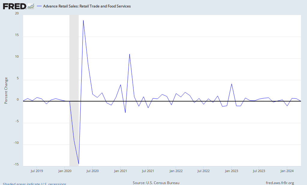
Retail and Food Services Sales - Lowest since July 2010

How robust is the recovery?


St. Louis Fed - Retail and Food Sales


Remember that back then, in July 2910, some were talking about a Double-Dip (Hi!) that was saved, IMHO, by:
a- The extension of the emergency and extended jobless benefits
b- Berna-man's speech hinting about QE2
c- Then it's confirmation
d- Then its start
e- Then by the fiscal stimulus package that was passed at the end of 2010 (payroll tax benefits, depreciation package for investment/capex)

a) Will last till the end of 2011, right?
b) Gone
c) Gone
d) It ends in 6 weeks
e) -- Payroll Tax Benefit: consumed by the increase in gasoline prices
----- Depreciation thingie: not sure. Need to learn more about it, but I'd say if the outlook doesn't improve too much people won't invest because of uncertainty even though it becomes 'cheaper'.

*Disclaimer: charts and data are presented as I receive/see them. Sources are usually not checked for validation and my own calculations are of 'back of the envelope'-type. I am aware that some math that I do myself might be wrong and/or misleading to some extent. In financial markets the rate of change of economic data is often more important than the actual level and the perception of 'what is priced in' is more important than 'what is actually going to happen'. This is actually the way people pick entry and exit points. So... yes, sometimes you might say 'This guy is an idiot, this is way wrong!' with a high conviction, being right. Not to worry. Markets are made of expectations and the clash of conviction between its participants. Portfolio managers know that being an idiot is sometimes profitable and being smart is often a bad choice. It is all reality, sometimes good, sometimes bad. By the way: corrections to my analysis and intelligent debate is welcome. theintriguedtrader AT gmail do com
Wednesday, May 11, 2011

Jeremy Grantham: Time to Be Serious (and Probably Too Early) Once Again

Not a lot to say about this piece by Mr. Grantham.
"Sell in May and go away" + oil shock + japanese issue impacting short-term (even though long term he finds the after-effects to be positive).

Those are the basic take aways.
He considers these 3 factors as more relevant than the market does and also thinks the current levels in earnings are to be watched.


2011 05 11 - Jeremy Grantham - Part 2 - Time to Be Serious (and Probably Too Early) Once Again

Confirming-NFP JOLTS and its momentum

Ladies... here we are again with the JOLTS. On the last data-release we came up with this analysis. Now we take a look at the March numbers.

The trend seems unchanged: improvement.
Remember that the JOLTS is released with a 1-month lag to NFP.

The NFP-like, SA, March number (Hires - Separations) looks good, like the NFP released in March.


But I'd like to look at the NFP-Like number, non-seasonally-adjusted-12-month change. The path in this number indicates the momentum in job growth, not levels. Reduced momentum despite decent levels?


The chart below is the 4-month acum, NSA, 3-month change (tough, huh?). There's seasonallity, so we'll compare apples with apples.

What is important to check on this chart is the distance between years. In late 2010 we saw a closing gap. 2010 was rising faster than 2009. The Dec-10 print was 27k higher than 2009. Great.
But since January this number came in negative and the distance to the previous year's metric has also been getting more negative/peaked, even though better than all years but 2010 and 2001.
2010 vs Aug09 (1,826) distance from last year (517)
2010 vs Sep09 (2,172) distance from last year (346)
2010 vs Oct09 (1,348) distance from last year  824 (top momentum?)
2010 vs Nov09   (628) distance from last year  720 
2010 vs Dec09     27  distance from last year  655 (peak?)
2011 vs Jan10   (134) distance from last year (161)
2011 vs Feb10   (265) distance from last year (131)
2011 vs Mar10   (424) distance from last year (159)


Again, strong NFP levels came in last Friday, revisions to the upside.
What I am worried with is the divergence between Household Survey x Stablishment (-190 x 250k~) and the recent surge in Initial Jobless claims.

If Household Survey + IJC are correct, coupled with these momentum charts above, the US 3.0% 2011 growth story is fairy tale.

*Disclaimer: charts and data are presented as I receive/see them. Sources are usually not checked for validation and my own calculations are of 'back of the envelope'-type. I am aware that some math that I do myself might be wrong and/or misleading to some extent. In financial markets the rate of change of economic data is often more important than the actual level and the perception of 'what is priced in' is more important than 'what is actually going to happen'. This is actually the way people pick entry and exit points. So... yes, sometimes you might say 'This guy is an idiot, this is way wrong!' with a high conviction, being right. Not to worry. Markets are made of expectations and the clash of conviction between its participants. Portfolio managers know that being an idiot is sometimes profitable and being smart is often a bad choice. It is all reality, sometimes good, sometimes bad. By the way: corrections to my analysis and intelligent debate is welcome. theintriguedtrader AT gmail do com