... is that there's not room for more cuts.
The gains in productivity in the U.S. have been massive since the crisis began. A lot less people employment and increasing output since the worst days of the crisis in 2009.
And the Non Farm Payroll monthly numbers have come in positive for many months.
If the economy was doing well I am sure labor mobility would be better.
Check out the 4 charts below.
Two of them regarding people who are voluntarily leaving their jobs, say, to seek better opportunities, follow their family elsewhere or simply lay back and party.
The QUITS show that we're better than 2009, yes, but barely. From the lows of late 2003 the 12m-rolling average is 25% below... and only 10% above 2009's lows. The raw NSA number... we're still way below the 2001-2008 range.
Are people afraid they won't get anything better in case they quit? Are people just not finding anything that would make them quit?


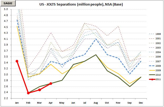
Now let's take a look at total separations (quits, retiring people, lay offs). We're still stuck at the lows.
In whatever metric you look at.
So people don't want to quit.
People don't want to kick back at home retired.
And businesses don't seem to be able to shed even more jobs.
These charts don't paint a very healthy picture of the american employment situation.

The gains in productivity in the U.S. have been massive since the crisis began. A lot less people employment and increasing output since the worst days of the crisis in 2009.
And the Non Farm Payroll monthly numbers have come in positive for many months.
If the economy was doing well I am sure labor mobility would be better.
Check out the 4 charts below.
Two of them regarding people who are voluntarily leaving their jobs, say, to seek better opportunities, follow their family elsewhere or simply lay back and party.
The QUITS show that we're better than 2009, yes, but barely. From the lows of late 2003 the 12m-rolling average is 25% below... and only 10% above 2009's lows. The raw NSA number... we're still way below the 2001-2008 range.
Are people afraid they won't get anything better in case they quit? Are people just not finding anything that would make them quit?
Now let's take a look at total separations (quits, retiring people, lay offs). We're still stuck at the lows.
In whatever metric you look at.
So people don't want to quit.
People don't want to kick back at home retired.
And businesses don't seem to be able to shed even more jobs.
These charts don't paint a very healthy picture of the american employment situation.
*Disclaimer: charts and data are presented as I receive/see them. Sources are usually not checked for validation and my own calculations are of 'back of the envelope'-type. I am aware that some math that I do myself might be wrong and/or misleading to some extent. In financial markets the rate of change of economic data is often more important than the actual level and the perception of 'what is priced in' is more important than 'what is actually going to happen'. This is actually the way people pick entry and exit points. So... yes, sometimes you might say 'This guy is an idiot, this is way wrong!' with a high conviction, being right. Not to worry. Markets are made of expectations and the clash of conviction between its participants. Portfolio managers know that being an idiot is sometimes profitable and being smart is often a bad choice. It is all reality, sometimes good, sometimes bad. By the way: corrections to my analysis and intelligent debate is welcome. theintriguedtrader AT gmail do com


